Thursday, October 7, 2010

Assignment 5 - Postcard

Hi everyone! Assignment 5: Making themed postcards using colour theory! I decided to go with Oktoberfest, otherwise known as Bierfest :D It was fun to do, though drawing with a mouse is a pain. Nontheless, with the help of illustrators auto-smooth function, my scribbles actually look like shapes.

Note: I've only put up this one for now, to be honest I haven't completed all the colour codes, so I will edit this one later today with the different colour schemes!


Friday, October 1, 2010

Assignment 4: Fear Appeal => Poster for Stress

Assignment 4 is about creating a poster based on fear appeal. This poster tackles some health matter and motivates the reader through fear appeal (perceived threat level and perceived severity of the subject). I decided to focus on Stress.

Stress is something that makes you feel extremely frustrated, and extremely constricted by responsibility or expectation or emotional duress. When you feel stressed, you want to break out, you want to scream and tear yourself away from the suffocating cage it places you in. This is the idea that I attempted to express, through use of my face, and a cling-wrap/underwater effect to illustrate the 'suffocation'. This suffocation and desperation on the face is what raises the perceived severity of the 'stress'. The use of a human face, with little editing except for the plastic-wrap/drowning, raises the perceived threat level of the disease, as it makes it very easy to connect to, and seemingly reflects a real-life human example.

Wednesday, September 15, 2010

Assignment 2: My Company

Welcome to Obvious Industries. We make puzzles. We love puzzles. This company isn't just about the thrill of solving the puzzle, it's about exploring. Satisfying human curiosity, and looking into the world of logic as something of a game. We don't just want serious thinkers to enjoy our products, we want people who love the experience of a puzzle just as much as coming to the solution. If you like puzzles, and you like puzzling, and you like puzzling about puzzling, then Obvious Industries is for you!

When I was a kid, one of the first puzzles I tackled was in chess, competing with my dad. He tended to win, but that's not the point. The point is I was exploring the world of puzzles, and I found it fascinating. Thinking ahead, thinking about consequence, about action and reaction, about physics, I started navigating that world and never grew tired of it. Even today I get stumped by puzzles, but I'm still grinning away while I do them. That's what Obvious Industries is about, loving the experience, and loving the satisfaction of solving them.

Assignment 2: Business Card

This post is following up on the previous abstraction process for Assignment 2. Making a the card proved to be difficult. It's a small amount of space, so bringing the right amount of information across to carry the message of the company, without cluttering it, was tough. (Not to say i've fully succeeded, I haven't shown the class yet). I'm happy with it though, and have two variations for the business card. Small differences, but each with different connotation. The sphere took some time, but I like it because it gives the picture more depth.

1) Note that the size is a bit skewed, since this is on an A4 sheet, unlike a real business card. This is the example displayed to the class. I really like the man walking on the spere, as if he's exploring the world of puzzles and looking for some solution to whatever problem he has, which now is to find out what this world he's in is. I like how it suggests the company is also exploring puzzles, and it feels like the company is at the same level as the consumer, just as curious, just as interested to solve.


2) This feeling is more technical and solid. There isn't any motion, as suggested by the walking figure in (1). There is not questioning factor. This picture seems more self assured, and more geared to the serious puzzler, it is a static image that suggests the pieces are the focus, the logic, the strategy. This is unlike (1) where it was the exploration and curiosity that was the focus. They appeal to different groups (I think!), because one is about cool-headed logic and strategy, while the other is about exploration and curiosity, and reaches more to a consumer that enjoys the exploration rather than the solution.

Sunday, September 12, 2010

Assignment 2: Abstraction

So for this week, we're told to simplify an image related to our imaginary company (based on previous assignment). So puzzles, solving puzzles, logic, i chose a chessboard. Easy right? Not exactly. The chessboard is already quite simple, albeit with many pieces. What was hard was choosing what to omit during the abstraction.

I realised there are two ways to do the abstraction. People recognize the chessboard for both its concept, and it's physical appearance. For example, the pawns and pieces, they are the concept of the game, with their rules and objectives. A chessboard is just a board without concept. However, a chessboard is also easily recognised by its physical appearance. This physical appearance being the lines of the chessboard. I realised through simplification that the concept was stronger than the board. The black vs white, showing some sort of puzzle or contest, the squares which show territory and general status of gameplay. I simplified based on these, moving down the chain both conceptually and physically. I reached that point where its meaning is lost, and chose to move on using more of the concept than the physical appearance. This being the very typical black-white orientation of many puzzle based games. (or dual-colour). Backgammon, chess, checkers, etc. This week is just the abstraction, not yet the business card, so i'll put that one in the next posting. Hope my process of abstraction below is clear. See the two main abstractions, one physical, the other conceptual.

Saturday, September 4, 2010

Assignment 1: Abstraction of Name

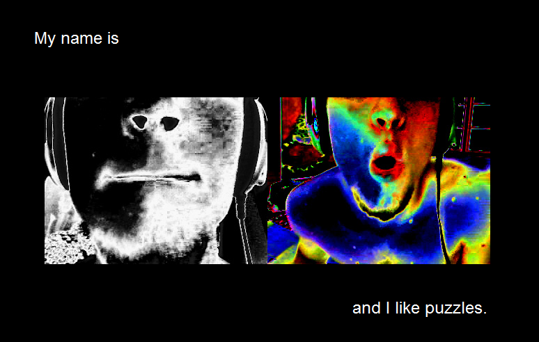
Hi everyone, for this assignment we were required to design our names using concepts and images common to something that we like. For example, I like puzzles and computers, hence the below are my initial ideas and my refined ideas on how to express that. Enjoy!

P.S I'm sorry I have little experience with blogs so this first post is very unattractive. I'll fix it soon.

--------------------------------------Initial--------------------------------------------


---------------------------------------------Refined---------------------------------------------

I edited the face one to give it more contrast and to make the "m" clear. I really like this one, even if it isn't strictly in line with the assignment.

I was told that the black lines dominate the picture, so I used that to draw attention only to the portion that exposes my name.

----------------------------------------------Decision and Refinement------------------------------

I chose to stick with the maze concept because I think that best captures what I like, and the idea of a puzzle. I attempted to add some concept to the maze (solving it), and created a 3 dimensional version.


I realised how hard depth is to create, but I traced my pencil sketch and it came out well. The colour choice was tough, we had been talking about colour theory last class, so I decided to combine these two warm colours together. It looks good to me!

Here is an edited 2D version of the original, as I was advised that the "o" was being buried by its surroundings, unlike the "m" which has a wide space to bring it out. I also gave it a mouse and cheese for the concept of the maze. The cheese makes you see the "o" too, which I think it still needed.

Tuesday, August 31, 2010

Hi!

Thats me. While writing this I realise it looks like i'm not wearing anything but that isn't true. The shorts are on the floor for a reason. Everything is. The picture shows what I like to do, and what I like. Shouting into a mic is only one aspect.

My name is Moritz, i'm American. I want to be a game designer, I really like game environments and effects.

This blog contains my progress for assignments for NM2208.